Building a statistics dashboard using Chart.js

Written by Daniël Niemeijer on 21st June 2017
During my internship at Spindle, I will look into and eventually create a statistics dashboard for the partners of our telephony platform VoIPGRID. This dashboard will contain several statistics which partners could use to manage their own company better.
The preferred statistics
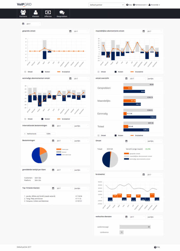
To find out what kind of statistics partners would like to see, I have been conducting several interviews with small and large partners to gain new insights. After analyzing the interviews, I found that the partner dashboard should contain a mix of financial statistics and call statistics, like:
- the revenue of a partner, split in call revenue and subscription revenue
- the costs of the calls and subscriptions for a partner
- the total amount of calls from clients and the average ring time
- a ranking of the five most phoned destinations
- the calls made over a fixed line, mobile phone or internationally
Based on this information, I created a sketch of the dashboard together with UX colleagues Tim and Luuk.
The partner dashboard frontend
Time to build the frontend! Let’s start off with some of the languages/frameworks I needed to create the dashboard. I used HTML and CSS in combination with the Django template engine to create a default layout and do some styling. Javascript and jQuery were quite handy when needing to solve logical problems. And of course, a chart library to create the charts which were present in the design.
HTML and CSS struggles
As frontend development is not one of my favorite things to do, I had some struggles along the way. As this was my first experience where a complete design was given up front, this meant there was no room for ‘this will do just fine’. There were some frustrations along the way and this GIF became really relevant at times. I started creating default blocks which needed to hold the statistical information. My newly created widget boxes had a nice div inside which I could easily access by the given ID with jQuery. With the final layout looking all good I was quite happy that I could proceed with implementing the statistical information itself.
Searching for the right chart library
I started off implementing the charts I needed to show on the dashboard. This meant figuring out what chart library to use. The current chart library in the VoIPGRID application is Morris.js. After digging in a bit deeper into Morris.js and looking into my needs I quickly came to the conclusion that Morris.js was not able to, native, fulfill all of my needs. The problem I had with Morris.js was that it did not natively support the feature of combining charts. The design contained four of these graphs, so it became quite essential for me that this feature was very easy to implement. Besides that, the customizability of the Morris.js graphs was not huge.
With these features in mind, I started my quest to find a library that could do these things for me. I quickly came up with two libraries that could do these things: D3.js and Chart.js. After looking into a comparison between D3.js and Chart.js I ran into this Stackoverflow post. This basically explained that D3.js was a bit too much for my use case and had quite a steep learning curve. Chart.js (version 2.5.0) was going to be my charting library. Besides having the features I needed, it also has great documentation and is maintained actively.
Implementations and complications
So with the chart library chosen, I could start writing the first basic functions which drew graphs or do some data manipulations like filling the date pickers. Combining the bar and line chart was indeed very easy with Chart.js. It uses stacks to accomplish this, so to achieve the revenue graphs I placed the line dataset on stack one, and both bar datasets on stack two. Besides this, it was really easy to apply a color styling to each dataset. In the end, the function to draw the call revenue, monthly subscription revenue and the one-time subscription revenue graphs was only 30 lines including documentation.
Of course it was not all plain sailing and there were some complications. The revenue overview graph, which contains four different horizontal bar charts, needed to have the same padding from each text to the graph, this meant calculating a custom padding based on the text width. After putting together a calculation which should do this, I found out something really weird. My calculation is the following:
padding = 150 - ctx.measureText(data.labels[0]).width + (53 -
ctx.measureText(data.labels[0]).width);
As I always wanted to have a padding of 150 in total, I thought that just subtracting the width of the text would have been enough, as this would add up to 150 in total width again. However, this created a weird offset in the padding. So I ran the numbers again and discovered that whatever I did resulted in the fact that I had to subtract my text width with 53 and add it to the previous calculation. I tried implementing this and, even more mind-blowing, this resulted in the graphs always having the correct padding. So if you might ever bump into this situation: 53 is the magic number.
Finishing touches
After implementing the graphs and the other statistical information, the dashboard was finished in terms of looks. In the end, as this is not my favorite part of developing, I am quite pleased with the result. Besides the fact that some translations and texts are not completely updated yet, the end result really matches the overall design. In my next blog post, I will dive into the backend of the dashboard.

Your thoughts
Written by wael on 26th August 2018
Hello ,nice job Daniel , I used to work with MS SQL server and power BI to analyze and visualize data but now I’ve changed to the .js frameworks like d3 and chart js ,I’m currently learning d3 and it will help me if you upload simple source code on git hub if you have it
thanks 🙂