Designing the dashboard of HelloLily

Written by Birgit Timmerman on 14th September 2015
Hi everyone! I’ve returned from my holiday and had a great time. Back to work! In my previous blog post, I wrote about doing UX research on HelloLily. I’ve been doing a focus group session, made concepts and tested them with a method called paper-prototyping.
Paper-prototyping
The last two weeks were very busy weeks in which I continued doing paper-prototyping. After the first session, a lot of usability issues were discovered by the respondents. I redesigned the concept and tested it again. After that session, I tested it again. This way, my concept went through an iterative process: designing > testing > redesigning > testing > redesigning… and so on.
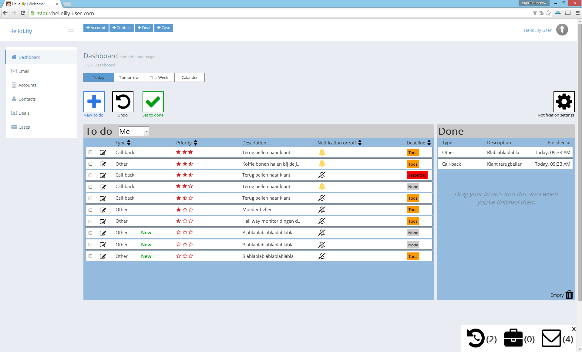
Below you can find a picture of the final design.
End results
The respondents were very satisfied with my ideas for the new dashboard. Right now, users don’t use the dashboard as much as intended. To improve the workflow of HelloLily, the dashboard needs improvement. The respondents feel that the workflow has a lot to do with time-management. During the focus group, we discussed what this should look like.
This new dashboard (you can see in the picture above) is an organized to-do list. Only the cases the users have to do today are displayed. Nothing more, nothing less, unless they want to see more (it’s optional). This way, they only have to focus on the things they have to do today, without the distraction of everything else they want to do later. This will result in a more restful state of mind. Lily will tell you when you have to do certain tasks. It should be optional whether you receive notifications about it.
It’s not intended to interrupt the users every time there’s a new case assigned to them. That will take them out of their workflow. That’s why you can decide to turn off all of the notifications by clicking the ‘notification settings’ button. In the lower right corner you can see how many call-backs, cases and unread emails you’re receiving.
When you’ve finished a case, you can drag them into the ‘done’ section, or select them and click the ‘set to done’ button. This way your to-do list will reduce and your done list will increase. This will give the users a feeling of accomplishment.
Of course, there is way more to explain about my design. If you send me a message, I’ll be happy to tell you all about it.
Some advantages of the new dashboard:
- Users have a clear overview of what needs to be done today.
- Users don’t have to remember things.
- Work unrelated things can also be added in the to-do list.
- HelloLily reminds its users when they have to do something.
- The possibility to switch between each others dashboards makes it easier to take over someone’s work when that person is, for example, ill.
- It makes dividing work easier.
- The notification bar in the lower right corner always shows them real-time information.
- The new dashboard fits right into the ‘Getting Things Done’ culture of Spindle.
An overall description of the book ‘Getting Things Done’, written by David Allen:
“Get everything out of your head. Make decisions about actions required on stuff when it shows up – not when it blows up. Organize reminders of your projects and the next actions on them in appropriate categories. Keep your system current, complete, and reviewed sufficiently to trust your intuitive choices about what you’re doing (and not doing) at any time.”
As said before, the respondents were very satisfied with the new dashboard. Below you can find some quotes the respondents said about my design (quotes are translated into English and ought to be anonymous).
“It looks great and easy to use. With the current dashboard, I have to look at so many different things and this dashboard shows one clear overview.”
“I totally see myself working with this dashboard. It is exactly what we’ve been discussing during the focus group. You’ve done a great job mapping out what we’ve talked about.”
What’s next?
Last Thursday, I sat down with the UX team, the product owner and some developers of HelloLily to discuss my design. I felt like I needed an expert review since I only used the feedback of users. And let’s be honest, sometimes the users don’t know what they want. Everyone was enthusiastic about my design, but I also had some tough questions that made me rethink about some of the decision I made, and that’s a good thing.
The next step is writing everything down. That’s what I’m working on right now. I will write my next blog post in about two weeks. I hope you enjoyed this blog post. If you have any questions concerning my concept or anything else, please ask them in the comment section below. Thanks for reading!

Your thoughts
No comments so far
The comments are closed.