How I improved the user experience of a dialplan interface

Written by Luuk Hartsema on 9th February 2016
Half a year ago I started working at Devhouse Spindle. As a user interface designer, I take responsibility for the creation of user interfaces that allow users to perform their tasks quick, easy and intuitive.
The dialplan interface
In the last couple of months, I’ve focussed on improving the dialplan interface. The dialplan is one of the most important features of VoIPGRID. It allows users to manage their phone numbers and set up what happens when there is an incoming phone call. I’d like to share some insights we gained during the process.
While I was looking at the dialplan, I identified a few user interface problems. The interface was very cluttered. Information was stacked on top of each other and there was a lack of hierarchy, which made it hard for users to quickly determine what information was most important or relevant to them.
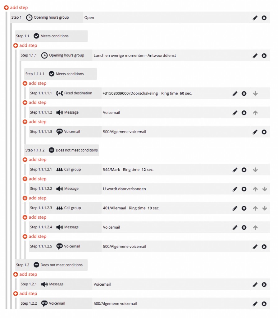 Dialplan June 2015
User feedback
My colleague Tim (who is very skilled in conducting user research) already collected valuable feedback from users. The issues clients encounter were clearly related to the way the interface was designed.
People told us the interface was complex and didn’t provide them with a clear overview of the actions that will be executed under certain circumstances. We noticed important information, that users needed in order to determine what was going to happen when someone would call their number, was missing in the interface.
With the feedback in mind, I went to work and designed a prototype that contained solutions for various issues.
Sketch file with all the designs
Reorganization of information
Visual hierarchy is one of the most important principles behind effective web design. It’s about organizing information in a way that is usable, accessible and logical. People innately scan for information that is relevant to them. Having a clear visual hierarchy helps people to easily find what they are looking for.
Looking at the hierarchy of the information within a dialplan step, I concluded we had to relocate the step identification number. Numbers like “1.1.1.2.3.1” are not clear visual elements that enable the user to quickly determine the meaning of steps. The unique identification number has no intrinsic value. They are only valuable if someone is going to refer to a specific step.
Changes in the placement of elements
I decided to place the icons up front instead. Icons have a large visual impact and are much easier to differentiate from each other. The video above shows the transition undergone by the interface.
Simplifying the interface
Halve the length of identification numbers
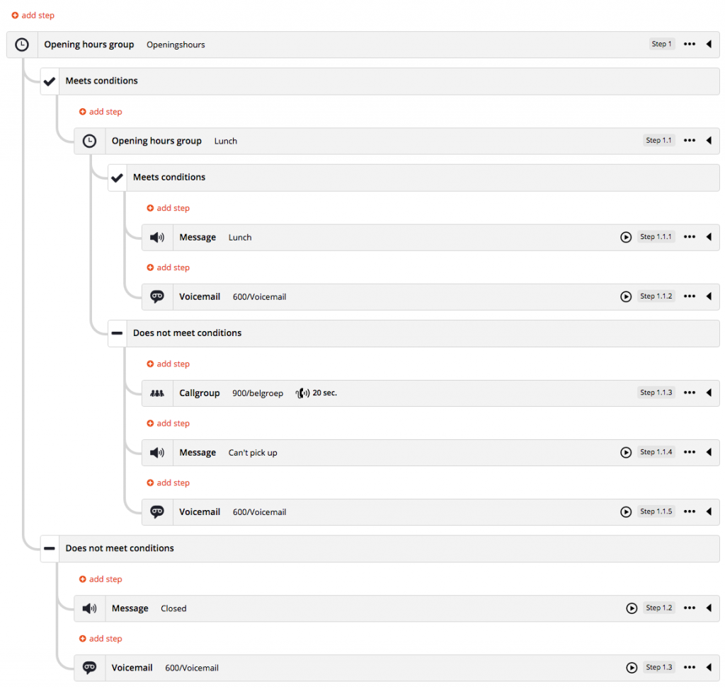
Step identification numbers could also become very long, which made them incomprehensible to read. The longest step identification number contained 21 numbers. It looked like this: “1.1.1.1.2.1.1.2.1.1.2.1.1.1.1.1.3.2.1.1.1”. Fortunately, this is not a common case in the VoIPGRID dialplan. This specific case was in one of the most extensive and complex dialplans created by one of our customers. I figured this could be improved and would also have impact on less extensive dialplans.
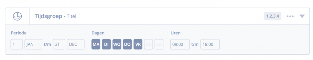
The step length increasements are due to modules with conditions. Take for example a time group. The time group module can be used to set the telephone routing during office opening and closing hours.
Conditions can be set and the system will check if the conditions are being met. For example, if the conditions of an opening hours module are set between 9:00 and 18:00, the steps listed under the conditions met section will be executed during that time.
In the interface, conditional terms have their own indentation level and receive a unique step identification number of their own. This is not necessarily required. The conditional terms appear as if they are an independent step, but they are always part of the parent element.
We could simplify the interface by making them a more distinctive part of their parent. The length of step identification numbers could be halved, which makes them easier to read. Support for mobile browsers would be improved by keeping the conditional terms on the same indentation level as their parent.
Clean indentation
The design of the dialplan contained seven dense vertical lines that functioned as rulers so users could differentiate the indentation levels. The vertical lines were hard to follow and differentiate because they were standing so close to each other. The density of these vertical lines was initially made like this to create more screen estate for the actual step information on mobile views. I’ve chosen to remove the rulers because I didn’t see the need to show rulers at places where they didn’t mark an indentation level. Instead I’ve chosen for a solution that looked more like a flow chart. It provides much more visual tranquility.
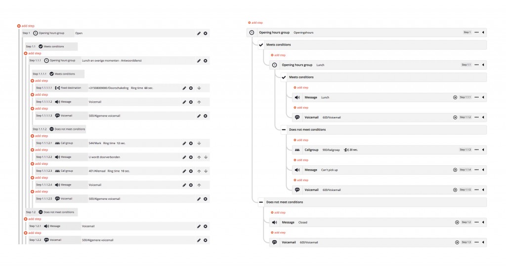
Indentation before and after
So many add step buttons
All possible locations for a new dialplan step are being shown, but users usually do not wish to add steps to all the possible locations. This causes unnecessary information overload in the interface. I was thinking about switching the logic around. Instead of selecting a location first, users should select what type of module they would like to add to their dialplan and then drag them into position or whatsoever. This would also enable us to tell users up front why certain steps cannot be added to certain locations. We didn’t implement this yet but we’re planning to do so in the future.
Adding context
Setting up a dialplan is hard if you don’t know what the context is. For example, if a customer would decide to add an IVR menu to the dialplan it required them to browse to a different page to listen to the attached audio message. The IVR audio message could be: “Press option 1 to talk to our customer support, press option 2 to talk to sales”, etc. Without this context, it’s impossible to determine what next actions should be placed under the conditional options of an IVR menu in the dialplan.
Wireframe designs of dialplan steps with togglable context
This was also applicable to time groups. There was no way to determine when the conditions of a time group would be met or not. In the prototypes I’ve designed, I added the possibility to toggle additional information for more context. I also did this for messages, voicemails and call groups. We received many compliments about this.
Prototype ready
Usually we create mockups in wireframe programs like Axure or InVision app, but the dialplan has so many variable options that it is very hard to test it with users. If we would have to create a mockup with these tools while giving a test user options to discover, it required us to create so many wireframes that it would take us ages to complete the wireframes and verify the conceived solutions.
Instead, we chose for a paper prototype session with users. We printed all the various components that could be combined together. Although I spend a day printing and cutting 43 A3 sized paper sheets, paper prototyping is a much easier and faster way to prototype such an interface. During our paper prototype sessions with users, we learned that we were in the right direction but still needed to tweak. We iterated and kept improving until we were confident enough to start implementing.

Paper prototyping
Implementation phase
In the last couple of months we implemented improvements in small parts. Some were easy to implement and some were more difficult. My colleague Redmer took responsibility for most of the coding. After the amounts of coding he has put in, he is in my opinion perfectly capable of calling himself the Dialplan Master. He had to hustle around with many technical restrictions, mostly because a big part of the dialplan logics get handled in the backend code.
With the completion of fixing the “save and cancel” button we’ve completed a milestone. Empty steps can no longer be saved. The dialplan of 2016 is much more user-friendly.
Dialplan January 2016
Future plans
We would love to see people being able to create and edit messages, call groups, time groups and more directly in the dialplan, instead of having to go back to the admin page to separately edit these modules. It would enable users to setup a dialplan much faster, so they can become even more productive.
We already have some ideas about how this ‘inline-editing modules’-part of the dialplan could work in the renewed interface. So, hopefully somewhere in the near future this belongs to the many possibilities of the VoIPGRID platform as well.

Your thoughts
No comments so far