Improving the workflow of HelloLily

Written by Birgit Timmerman on 9th July 2015
In my previous blog post I told you that I started with my first two research methods; in-depth interviews and card sorting. Both methods gave me really good intel about the usability and interface of HelloLily. The main goal was to find a way to improve the learnability and practicability of the CRM (I wrote about this in my second blog post). Not only did I figure out the reasons why HelloLily scores low on learnability and practicability, I also noticed that the workflow of Lily needs improvement. Some respondents even came up with very interesting suggestions on how to improve this. The next step: preparing a focus group.
Focus group
During a focus group session, a topic is presented to a small group of people. They will start a discussion and share their individual ideas, motives and needs about that topic. I’ll be the ‘monitor’ and make sure everyone gets a say. Advantages of this method, for me, are getting insight on everyone’s opinion, needs and wishes concerning HelloLily. The interaction between the group members stimulates creativity.
The card sorting and especially the interviews led to one particular point of improvement: the workflow. A lot of times during the interviews, HelloLily was being described as ‘devious’. Executing small tasks needs a lot of work, users have to remember things on their own and there’s no clear overview of what needs to be done. A CRM is meant to take over certain tasks for you, to make your work easier. But until now, the users feel HelloLily has not yet reached that point.
Some users gave interesting ways to improve this issue:
“It would be great if Lily gave you some kind of notification / reminder / pop-up about new cases, call-back requests and emails. Also, you need to be able to send these notifications to your colleagues. We are now using Slack for these kinds of things. So, we are using multiple systems, which deteriorates the workflow.”
After analyzing the results of the card sorting and the interviews, this was the main topic for the focus group session:
How can we enhance the integration of Lily, within HelloLily, by using notifications / reminders / alerts / pop-ups about for example cases, emails, call-back requests in order to improve the workflow?
The focus group resulted into a great session. Together we thought of ideas and created concepts. A summary of the results:
“The time management has a lot to do with the workflow. If we created a time management system on HelloLily’s dashboard, Lily tells you what you have to do today. An addition would be a clear overview of everything you want to do today, like a simple to-do list. Once you postpone a task to ‘tomorrow’, it will disappear and automatically pop up tomorrow. This way, you only have to focus on the things you have to do today, without the distraction of everything else you want to do later. This will result in a more restful state of mind. The time management system will tell you when you have to do certain tasks. It should be optional whether you receive notifications about it.”
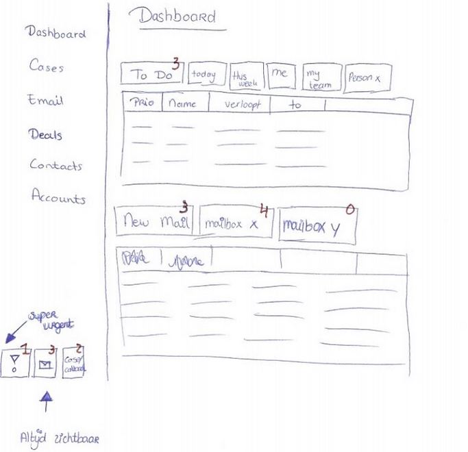
After having a discussion about the topic, I asked them if they could make drawings of how they think the new dashboard should look like. The respondents made very useful concepts. The drawings they made were actually very similar to each other, which is good for my research.
Here you can see a picture of one of the drawings a respondent made:
Concepting
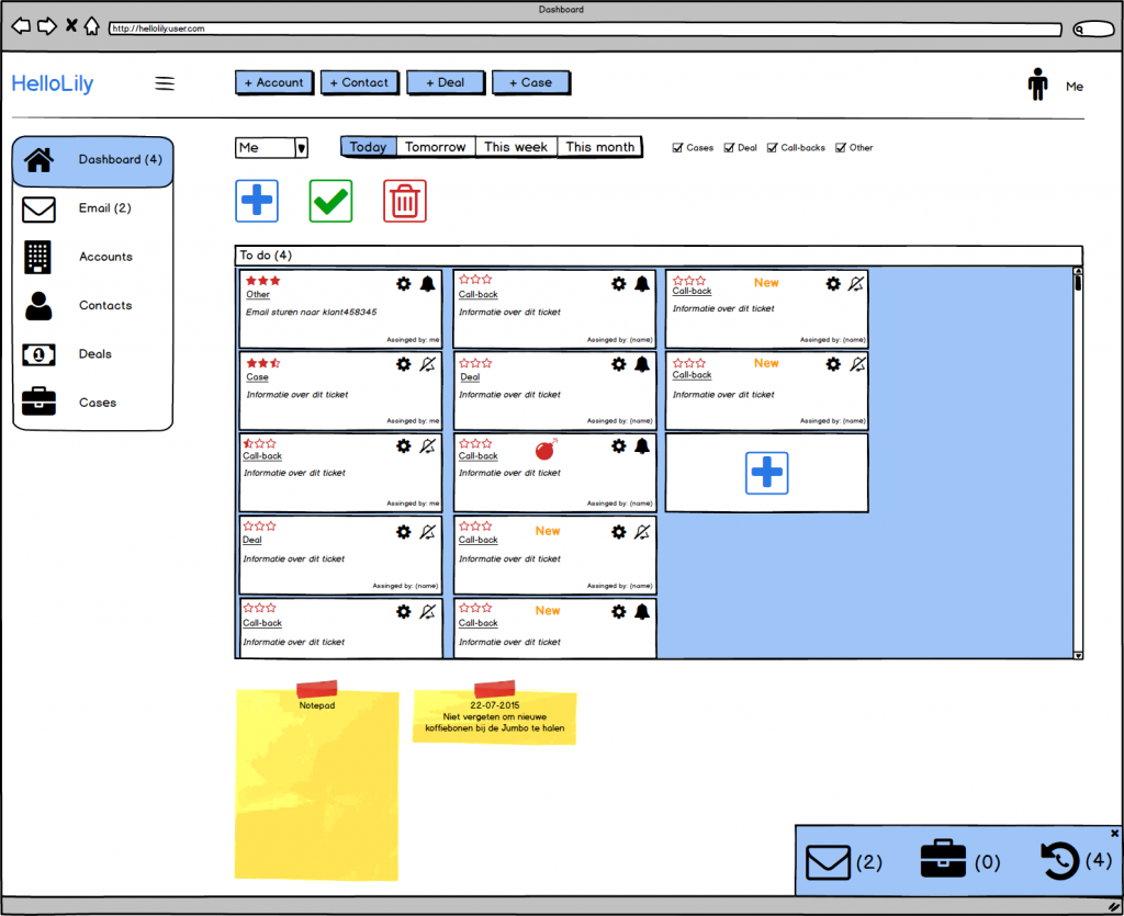
After analyzing the results of the focus group session, it was time for me to combine all of the results I have so far and make concepts out of it. I used a program called Balsamiq. Balsamiq Mockups is a graphical user interface mockup builder application. It allows the designer to arrange pre-built widgets using a drag-and-drop editor. By using Balsamiq, I was able to make concepts in a effective and quick way. The appearance of these concepts doesn’t match with the design of HelloLily, but that is not a problem because during user testing it’s all about the interface.
Below you see a picture of the final concept I’m using for the first user testing session.
User testing
User Testing is essential in designing interface. You can design the most beautiful things but there is no such thing as a perfect interface. Every user thinks differently and is used to different things. According to Jakob Nielsen, in order to find the most usability issues, your design must be tested by a minimum of five respondents. Once you’ve addressed these issues in a new design, you need to test again. In total, you need to test your design three times.
During this research I’m going to sit down with users and present them my concept. Together we will ‘walk through’ the concept. With every step I’ll ask the users what they expect when they click on it, if they understand everything they see and if not, why don’t they understand it and what do they want to see instead?
It will create a big list of usability issues. I can use that to redesign it. By now, I tested my first concept with five users. I got some very useful results. The next step is redesigning it.
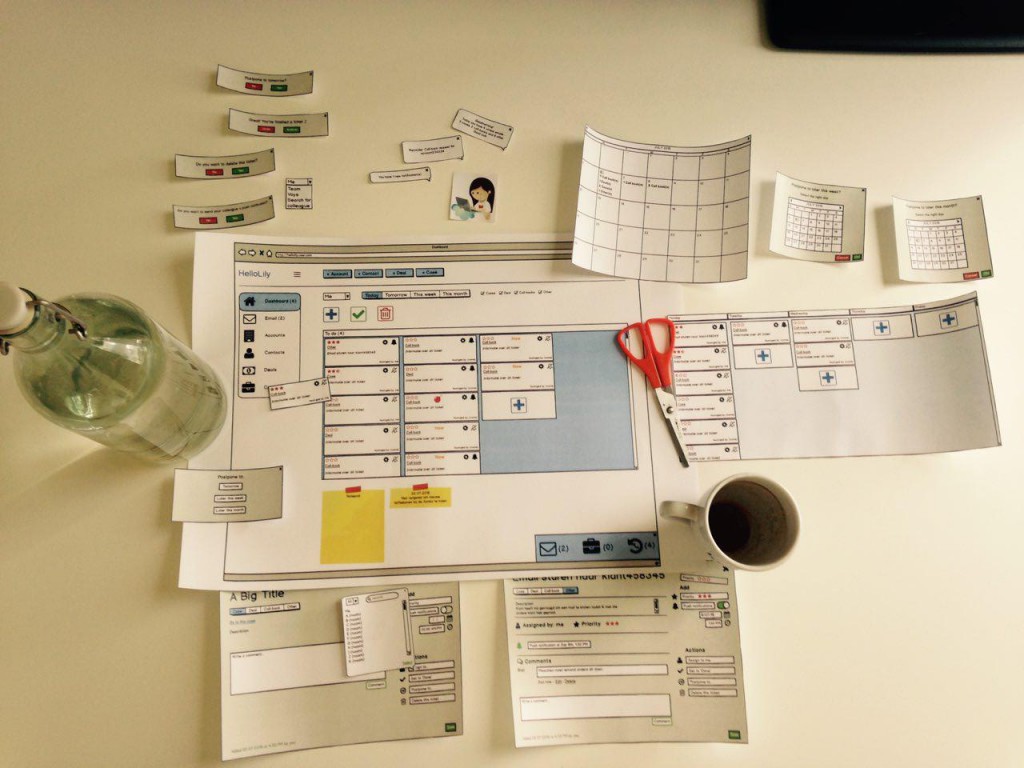
Below you can see a picture of the concepts I used for this research:
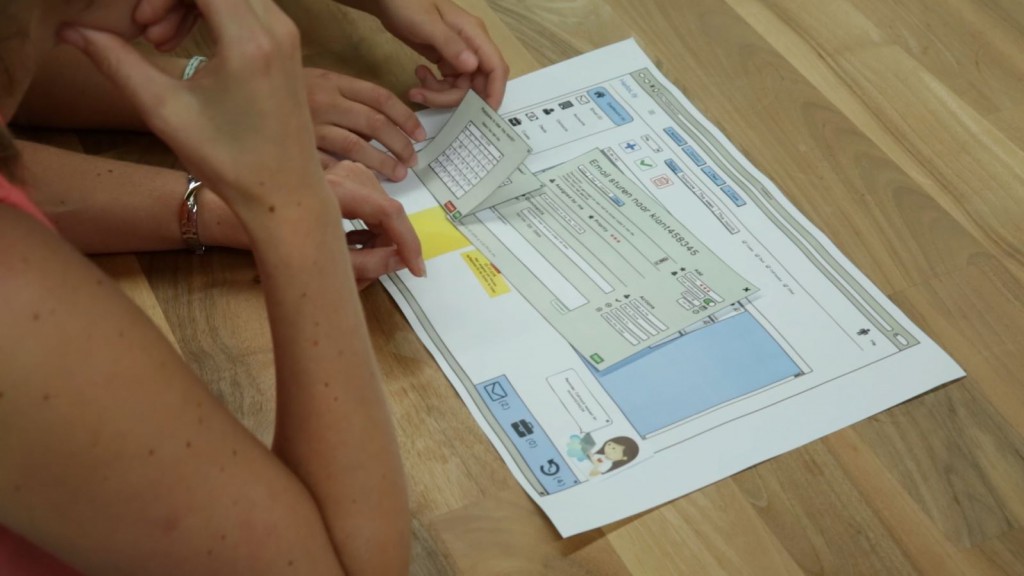
The second picture shows one of the sessions.
The next step
As I mentioned before, now it’s time to redesign my first concept and prepare for the next user testing session. That’s what I’ll be working on this week. After that, I’m taking a vacation of five weeks, so I’ll write my next blog post in about six/seven weeks.
I hope you liked this blog post. If you have any questions concerning my blog post, project work or anything else, don’t hesitate to ask them in the comments below. Thanks for reading and enjoy the summer!

Your thoughts
No comments so far